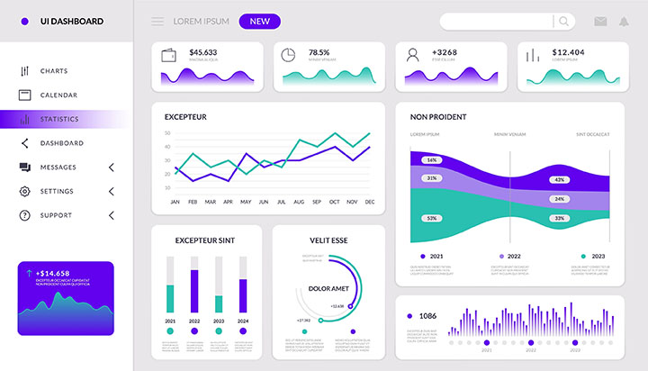

A graph is a visual representation of data. It is a diagram that shows how two or more quantities are related to each other. The quantities are usually represented by points on a grid, and the lines connecting the points show how the quantities change together.
There are many different types of graphs, but some of the most common include:
Graphs are a very useful way to communicate data. They can be used to show trends, compare different things, or make predictions.
In addition to the two axes, graphs also have a title and labels for the axes. The title tells you what the graph is about, and the labels tell you what the numbers on the axes mean.
Graphs are a powerful tool for understanding data. They can help us to see patterns that we might not be able to see otherwise. They can also help us to compare different sets of data and to make predictions about the future.
The scientist graphed the data to see if there was a correlation between the two variables.

Noun: graph.
Adjective: graphical.
Verb: to graph.
Synonym: chart, diagram.
The word "graph" comes from the Greek word "graphein", which means "to write" or "to draw". The word was first used in English in the 17th century to refer to a diagram or chart that shows the relationship between two or more variables.
What is a graph useful for?
Question:
What is a graph and how is it used in science?
Answer:
A graph is a visual representation of data. It shows the relationship between two or more variables. The variables are plotted on the axes of the graph. The x-axis is the independent variable, and the y-axis is the dependent variable.
Graphs are used in science to represent and analyse data. They can be used to:
There are many different types of graphs, each with its own strengths and weaknesses. The most common types of graphs used in science are:
Line graphs are used to show trends in data over time. Bar graphs are used to compare data between different categories. Pie charts are used to show the parts of a whole. Scatter plots are used to show the relationship between two variables.
Here are some additional points that could be included in the answer:
Address
Developing Experts Limited
Exchange Street Buildings
35-37 Exchange Street
Norwich
NR2 1DP
UK
Phone
01603 273515
Email
hello@developingexperts.com
Copyright 2025 Developing Experts, All rights reserved.